Ayoba Packaging Rebrand
South Africa-Inspired Packaging Design


Meat the new Ayoba.
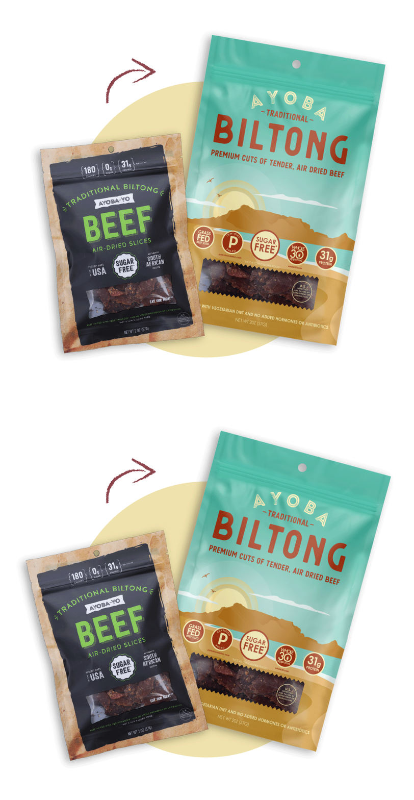
Ayoba-Yo approached Ok Yellow with a 2-fold problem: their packaging got lost on the shelves and it didn't reflect the brand's personality. Our goal was to show off Ayoba's South African roots with vibrant colors and scenes that reflected their authentic home recipes. The recipes are not only authentic - they're healthy too, so we made sure to showcase that with bold callouts. We dropped the -Yo for a punchier name that matches the energy of the color palette - and it's easier to say with your mouth full of biltong! All of this came together to create a premium yet approachable brand that tells a more complete story about Ayoba's origin and quality products.

A New Look
Ayoba's new Biltong packaging is simplified to highlight important information. Illustrations in the style of retro travel posters show off the beauty of South Africa, giving the Ayoba product line a unique, laid-back vibe. Friendly fonts help to brand this product as not just another Biltong brand, but a labor of love that has evolved out of the owner's home recipe.


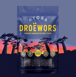
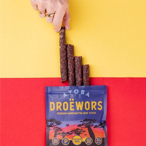
Grab-and-go Droewors beef sticks were a new addition to the Ayoba family. The Droewors packaging is bold and readable at a glance. Each product is as colorful as it is flavorful - refreshing in a market filled with masculine elements and neutral palettes.


